Swiper: UX/UI re-design
August 4, 2017
In 2016, Swiper let users earn real rewards—cinema tickets, vouchers, products—just by engaging with ads on their smartphone lock screen. It was an early pioneer in reward-based mobile engagement.
But after a few months, user fatigue hit: clunky UX, unclear reward flows, and a dated UI led to churn.
As Product Designer, I led a complete product redesign to bring clarity, gamification, and modern engagement to the app—turning Swiper into a product users loved again.
Product
Swiper – Rewarded Lock Screen App
Skills
UX Diagnosis
UI Redesign
Gamification Design
Conversion Optimization
Mobile Product Strategy
My role
Product Designer
Timeline
Q1 2017 – Q2 2017
Team
Nathanaël J. (CTO), Gabriel Marquet (Software Engineer), Antoine Coskun (Web Developer), Margot Riche (Digital Project Manager)
Context and Challenge
Swiper was an innovative mobile app launched around 2015–2016. It rewarded users with points for viewing ads directly on their lock screen. These points could then be redeemed for cinema tickets, vouchers, or various products.
However, after a few years, user engagement started to drop, and signs of fatigue became evident:
“I can’t find where my rewards are.”
“I don’t really understand how I earn points.”
“It feels like an app from the early 2000s.”
These insights, gathered from focus groups and user behavior analytics (such as drop-off rates, time spent on task, and retention issues), made it clear that a full UX redesign was necessary.
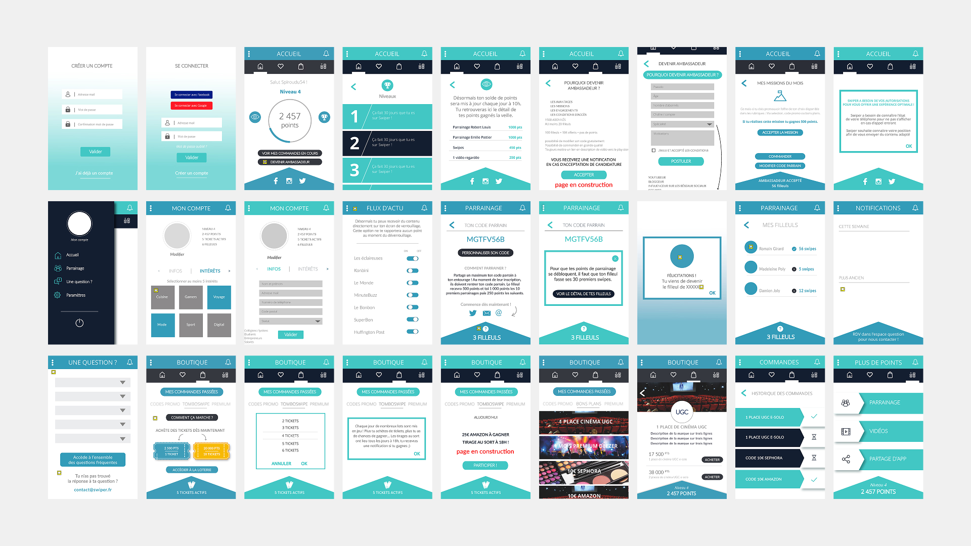
UX Diagnosis: What Wasn’t Working
We identified several major pain points that limited both user satisfaction and product growth:
-
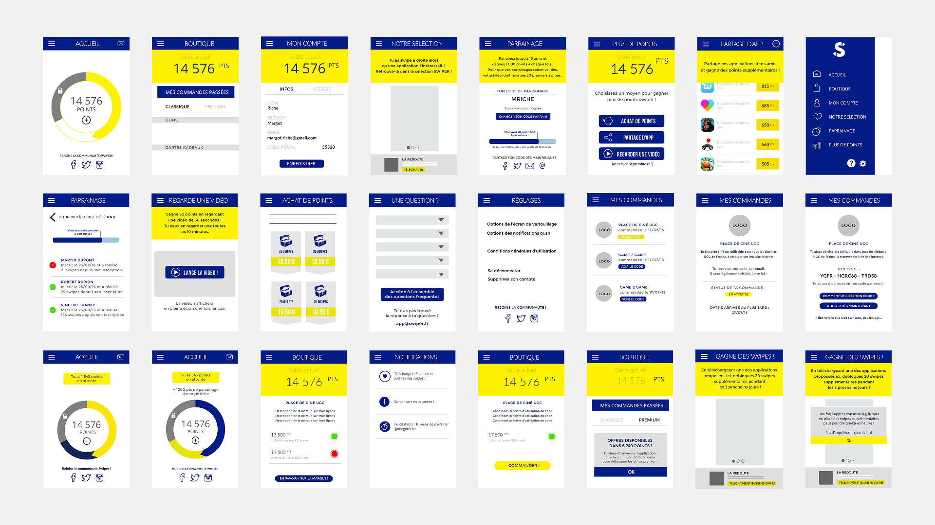
Confusing navigation: scattered menus and poor hierarchy made it hard to know where to go or what to do.
-
Lack of motivation: no clear sense of progress or achievement, which reduced stickiness.
-
Outdated visual design: flat, uninspiring UI that no longer matched modern standards.
-
Underperforming referral system: users rarely shared the app because it lacked incentive and clarity.
-
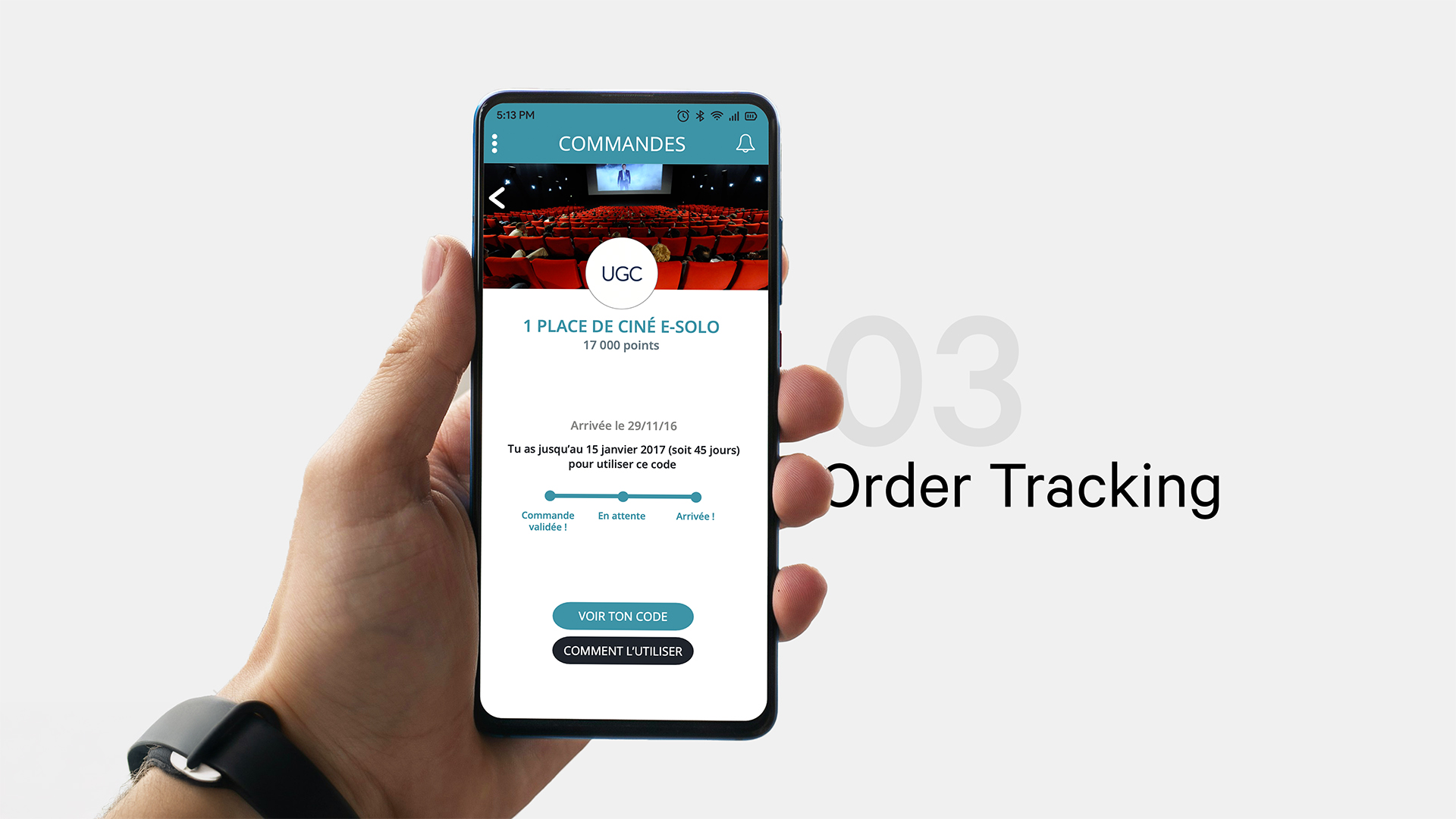
Clunky purchase flow: unclear order statuses and delays caused frustration.
-
No personalization: the app delivered the same experience to all users, regardless of their interests.
What Changed
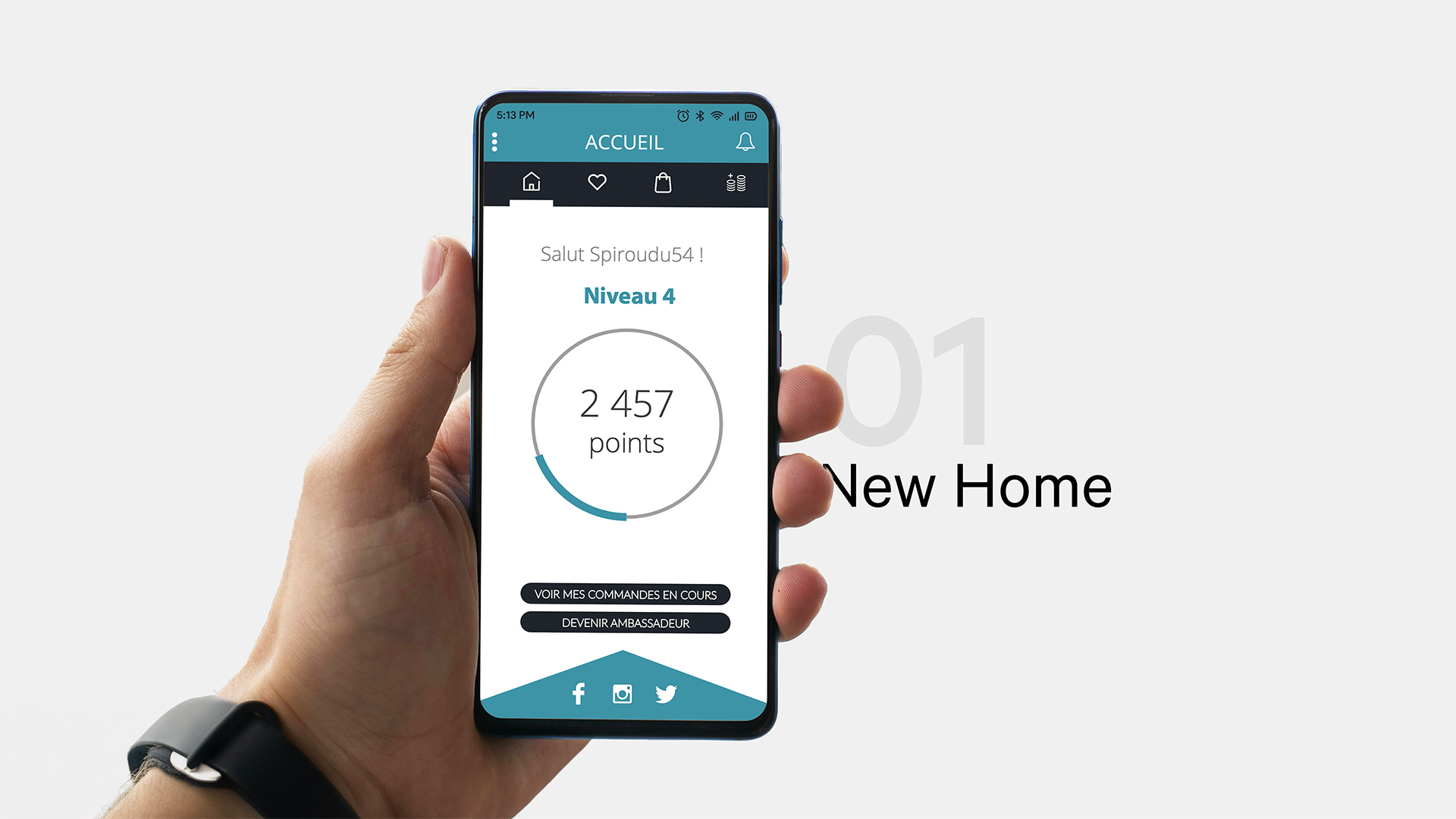
Navigation and structure
We introduced a clear, bottom-tab navigation aligned with common mobile UX patterns. Secondary actions were moved into a contextual menu to reduce visual clutter.
Gamification and user motivation
A level system was added to reward ongoing engagement. Users could now track how they earned points—whether from swiping, watching videos, or referring friends. We also introduced monthly challenges and an ambassador program.
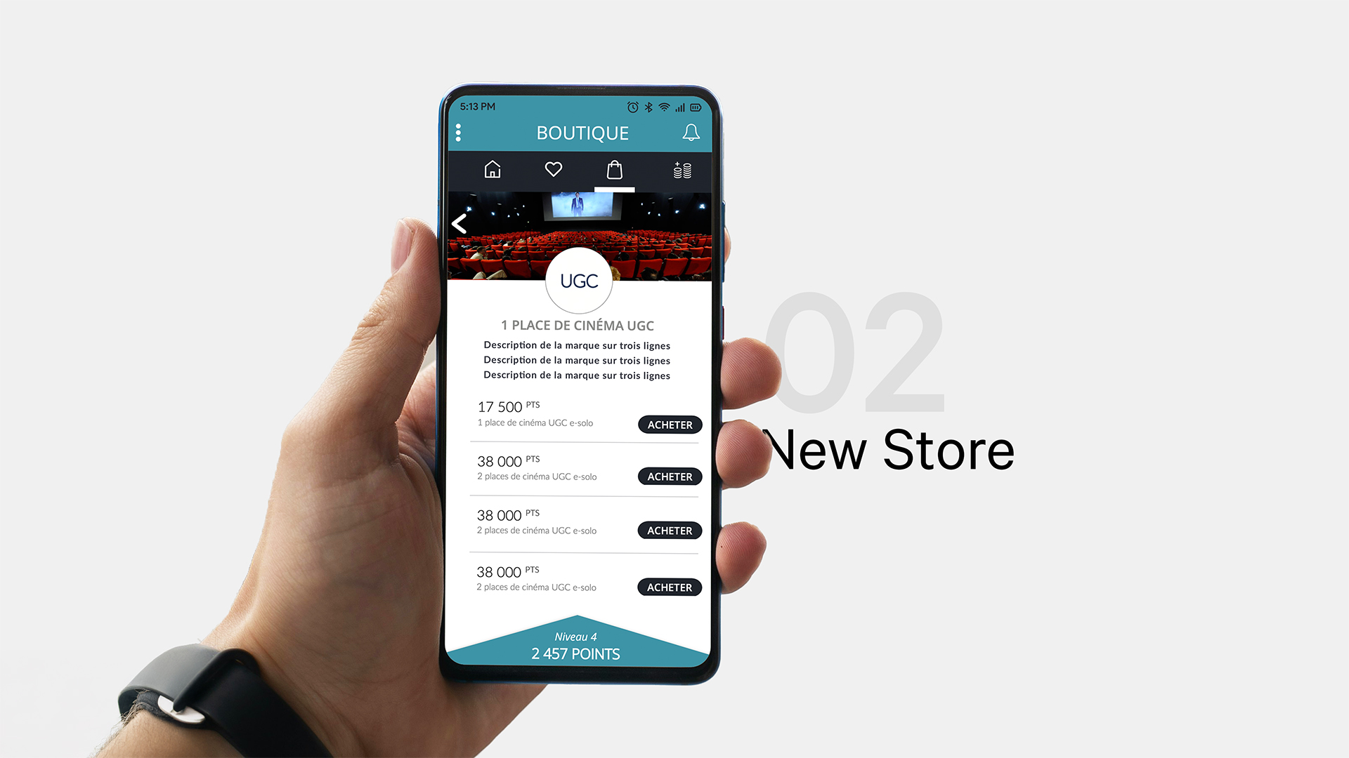
Shop and reward experience
Products in the shop were now accompanied by clear visuals, descriptions, and fulfillment status. We also added a lottery-style system (« Tomboswipe ») to increase daily activity.
Referral system
The referral flow was reimagined. Users could customize their code, see detailed activity from each referred friend, and better understand how rewards were unlocked.
Clarity and transparency
A new notification center grouped recent updates in a clean, readable way. Explanations were added to clarify reward delays and reduce user support load.
Visual design
We introduced a new visual identity using a modern color palette and typographies (Open Sans and Lato), with a mobile-first layout and responsive micro-interactions.
Results After Launch
The redesign was launched across app stores and had a measurable impact in the first few months:
-
23% increase in monthly active users
-
38% increase in average engagement (measured via sessions, swipes, video views)
-
2.4x improvement in shop conversion rate
-
52% growth in referral usage
-
30-day retention rate increased from 18% to 32%
-
Over 300,000 total downloads, with renewed momentum post-launch